Fitted Project Summary
Fitted is a personal trainer application for new or advanced gym goers who want to get into better shape. The purpose of this case study was to design a friendly and welcoming environment for users. I used a gamification approach to encourage users to stay on track with their goals and to enjoy their experience.
My Responsibilities
- User Research
- Experience Design
Timeline
3 Month
Interesting Facts
This project I explored the entire process of UX design from research all the way to finalized stage.
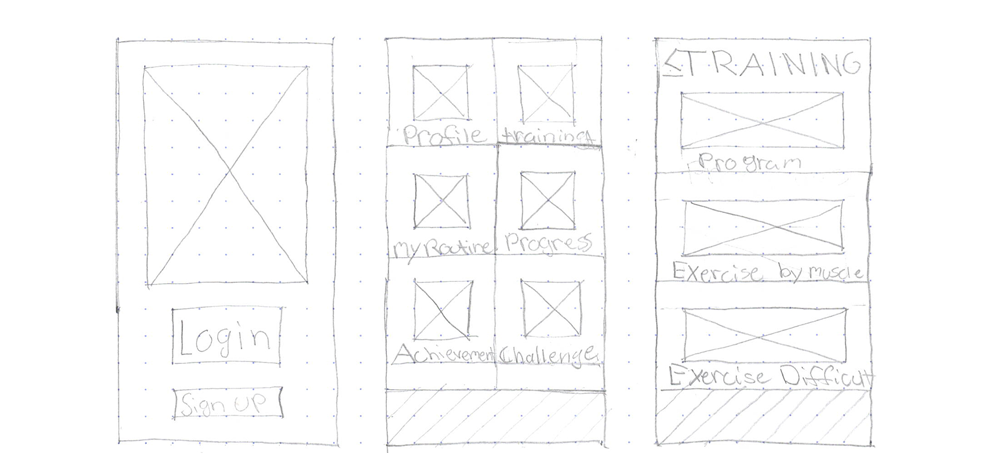
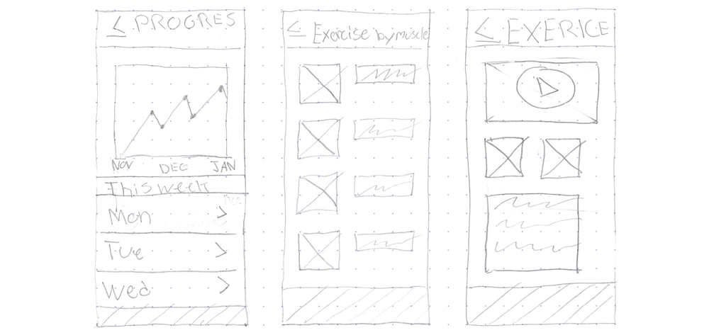
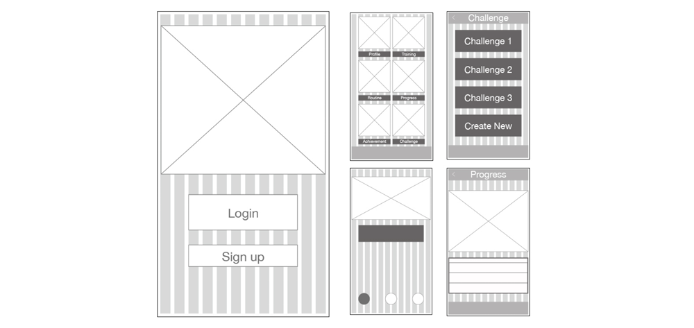
Low-Fidelity
Since the research was already proved I was able, to begin with, rapid low-wireframe sketches to illiterate what the application experience would be like for the users. Based on the research data I was able to create sketches that met the user’s needs and goals and avoid situations that may cause frustrations.
Take Aways
- Users will need to able to view the workouts, to understand how each workout will perform. Need a progress chart that is engaging for users and to help monitor their progress.
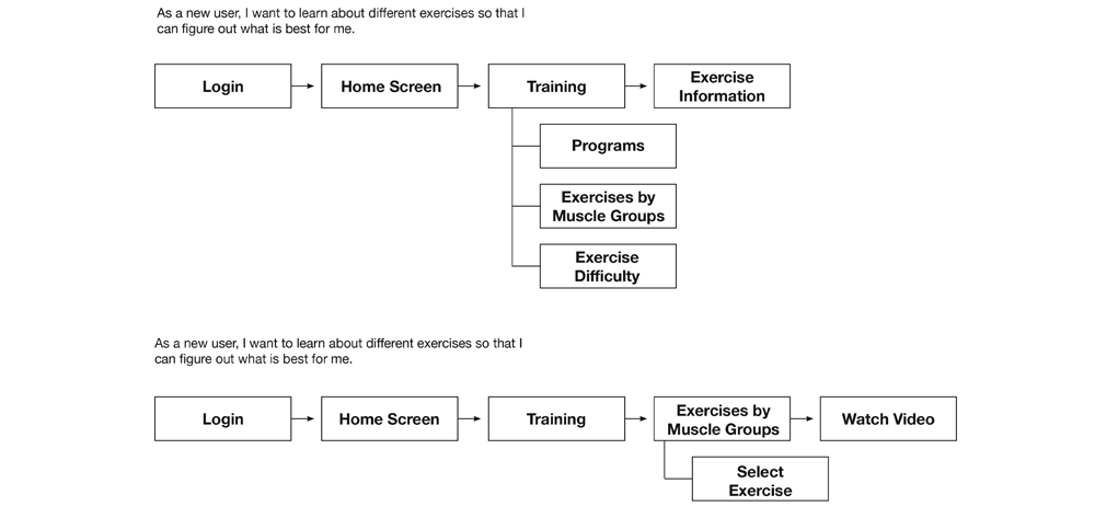
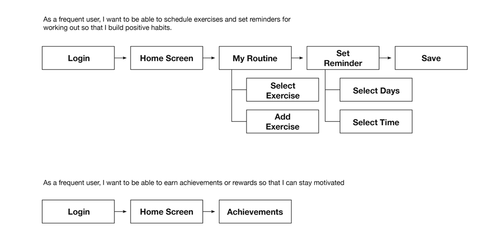
User Flows
I began creating user flows to understand how users will complete their tasks while using the application. Understanding what users are expecting while searching for specifics will help create a better experience and reduce any frictions users would usually encounter when using other fitness applications.
Take Aways
- Users who are new to a specific industry will need more guides and help to understand what they need in a fitness application.
- I needed to make the menu options obvious for users and not use the language they use in fitness.
Med-Fidelity Grid
I created med-fidelity grid wireframes to understand where the placements of the elements of the application. I used a 12-grid layout when designing the application, using this grid layout made it easier to observe how the elements of each page would be laid-out and how they will complement each other.
Take Aways
- How the placement of elements will effect the users experiences.
- How to place as much information as possible but not too much to overwhelm the users.
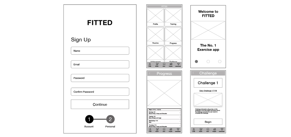
Med-Fidelity
I created mid-fidelity wireframes to understand how to establish a hierarchy in the application. Later I created a user test from my wireframes to observed how my user would interact and navigate to complete their goals while using the application.
Take Aways
- I learned how what font sizes are appropriate to establish a hierarchy for user to understand.
- Understanding how spacing is vital to the user’s experience, making it easier for the users to read the text and navigate through each page.
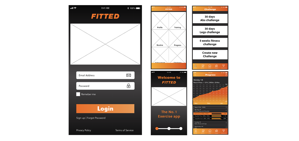
High-Fidelity Wireframes
I created high-fidelity wireframes using the color orange to evoke the emotions of joy and welcoming to the users of the application. I later tested my wireframes with users to observe how the users feeling when using the prototype.
Take Aways
- I learned that the color scheme of the app didn’t make the app feel joyful but more like Halloween.
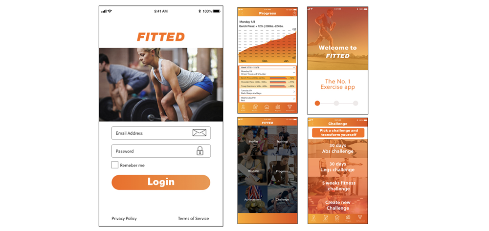
Revision Fidelity Wireframes
After my user tests, I re-designed the Fitted application by replacing the black with white. I kept the layout and introduce more orange accents to evoke the joyful and inviting feeling the users for are new to fitness.
Take Aways
- The users had a better response to the application.
- The app evoking a more joyful and inviting feeling to users who are new to fitness.
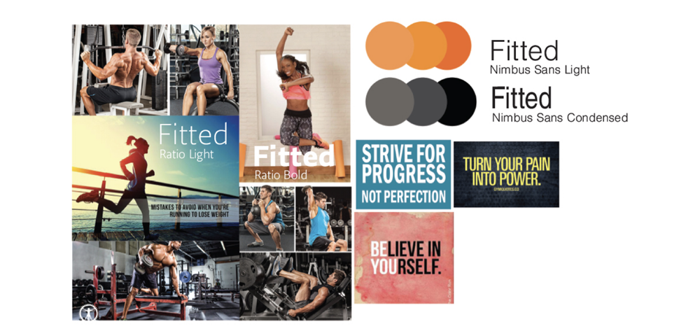
MoodBoard
I create a mood to understand what emotions I want to evoke in the users while they use the application. I used images of individuals working out and enjoying their workouts and focus on what they are doing. I included motivational quotes to motivate users to complete their workouts.
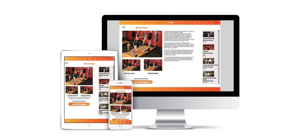
Responsive Design Mockups
Designing for tablet and desktop I stayed consistent with feel and placement of the mobile design, causing less friction for users to achieve their objectives when attempting their tasks.